The madness of white backgrounds for text on screen
I’ve created a browser extension that ensures that background colors for text are not excessively bright. That’s the subject of my latest post in my tech blog: glareless.
This post is about the problems with white backgrounds for reading.
Contents
- White background on screen is bad for reading
- Pure white as a background makes no sense
- Some coping strategies
- Better coping strategies
- The ideal fix may never come
White backgrounds on screen are bad for reading
Why is it that many text-heavy websites, among them most newspapers and
magazines, use full 100% white for backgrounds? Perhaps they think it produces
the illusion of white paper.
Whatever the reasoning, it’s a bad idea.
I’ve used off-white backgrounds for my websites for many years, based on some intuition that 100% white was too bright. I’m not alone there. Many websites use off-white backgrounds for text. There are even articles offering suggestions for off-white hues, like this one, 15 Alternatives to Your Website’s White Background, which says:
Pure white can certainly look classy and timeless, but it can also be harsh on the eyes. The brightness of pure white creates a glare effect, which can be uncomfortable, especially when there’s a lot of it on the screen. It’s like staring into a flashlight for too long—not a pleasant experience!
Recently, while checking out fonts from the excellent Tiro Typeworks
(see 1), I was intrigued by how muted the background was in their
font testing widgets. The background color was rgb(227 229 225), which is a
slightly greenish gray, with 89% brightness.
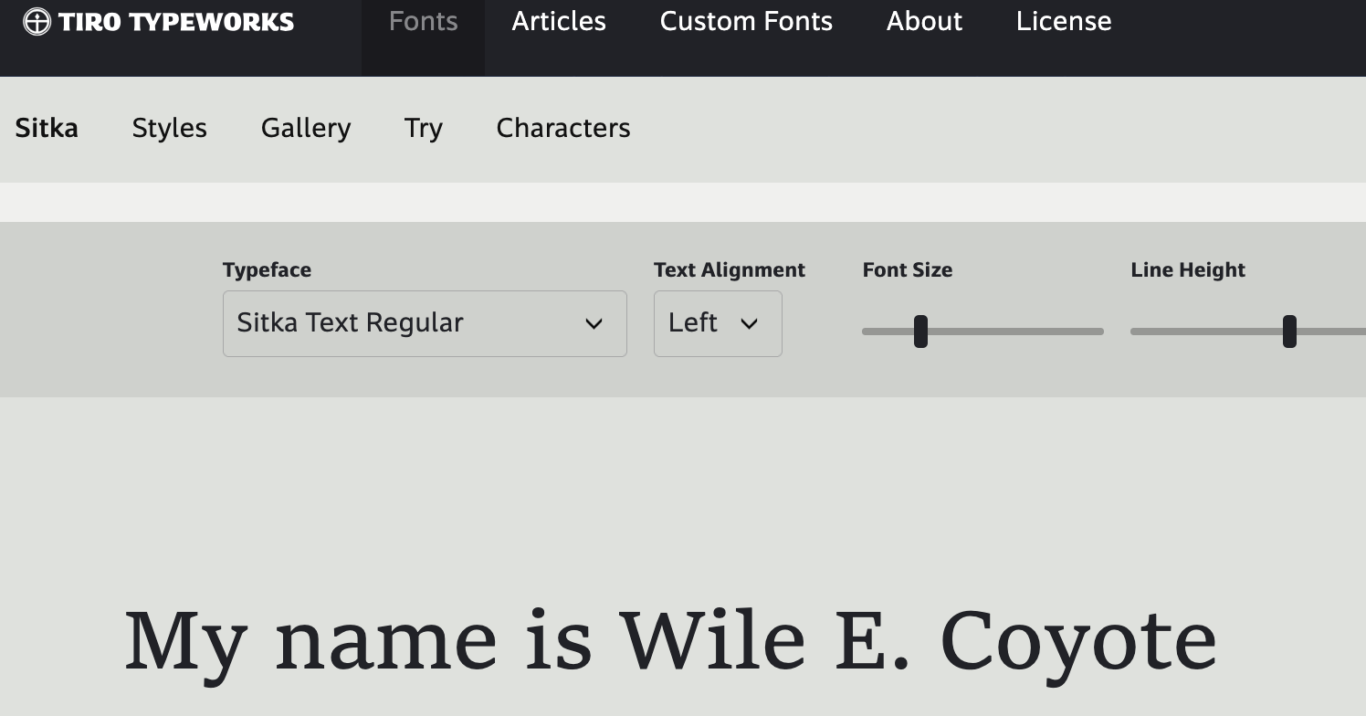
Tiro Typeworks testing area uses a low brightness background
I wondered what would happen if I used that background for my websites. At the time I was using a yellowish gray with 96% brightness. Doing before/after comparisons, I was surprised to find that the font color seemed darker with the background from Tiro Typeworks. How could this be?
The type designer Erik van Blokland has a good explanation, in two Mastodon posts2,3:
When rays of light hit your cornea, and then your lens, through the soup of the vitreous body, and finally upsetting a photoreceptor in your retina, at every step the ray diffracts, it spreads a little. Only light does that. Darkness is the absence of light, it is created and noticed in your brain. It has no physical properties. So: light always gets bigger.
Dark shapes on a light background? The light will eat them and they shrink. Light shapes on a dark background: they appear bigger.
For dark text on light background, on screen, a bright background “will eat” the dark text. The brighter the background, the more the text shapes are “eaten”. True of white paper too, but paper reflects light, while screens emit light.
Serif fonts, and especially old style fonts, have thickness variation in their shapes. Some letter strokes are thin, some thick. A very bright background will make the thinner areas comparatively thinner. Many old-style serif fonts appear congested on screen, when used on a very bright background.
I didn’t like the greenish tint of the background from Tiro, but for my sites I adopted (in late 2025) a neutral gray with 92% brightness, and to my eyes, text looks more matte, closer to the illusion of ink on paper.
Pure white as a background makes no sense
Pure white, on screen, is the brightest a screen can get. Out in the world, white paper is not the brightest object you’ll see.
To try to quantify this, I set up a camera on a tripod and spot-metered to my gray card, locked the camera exposure, and then I took a photo of a page of white paper.
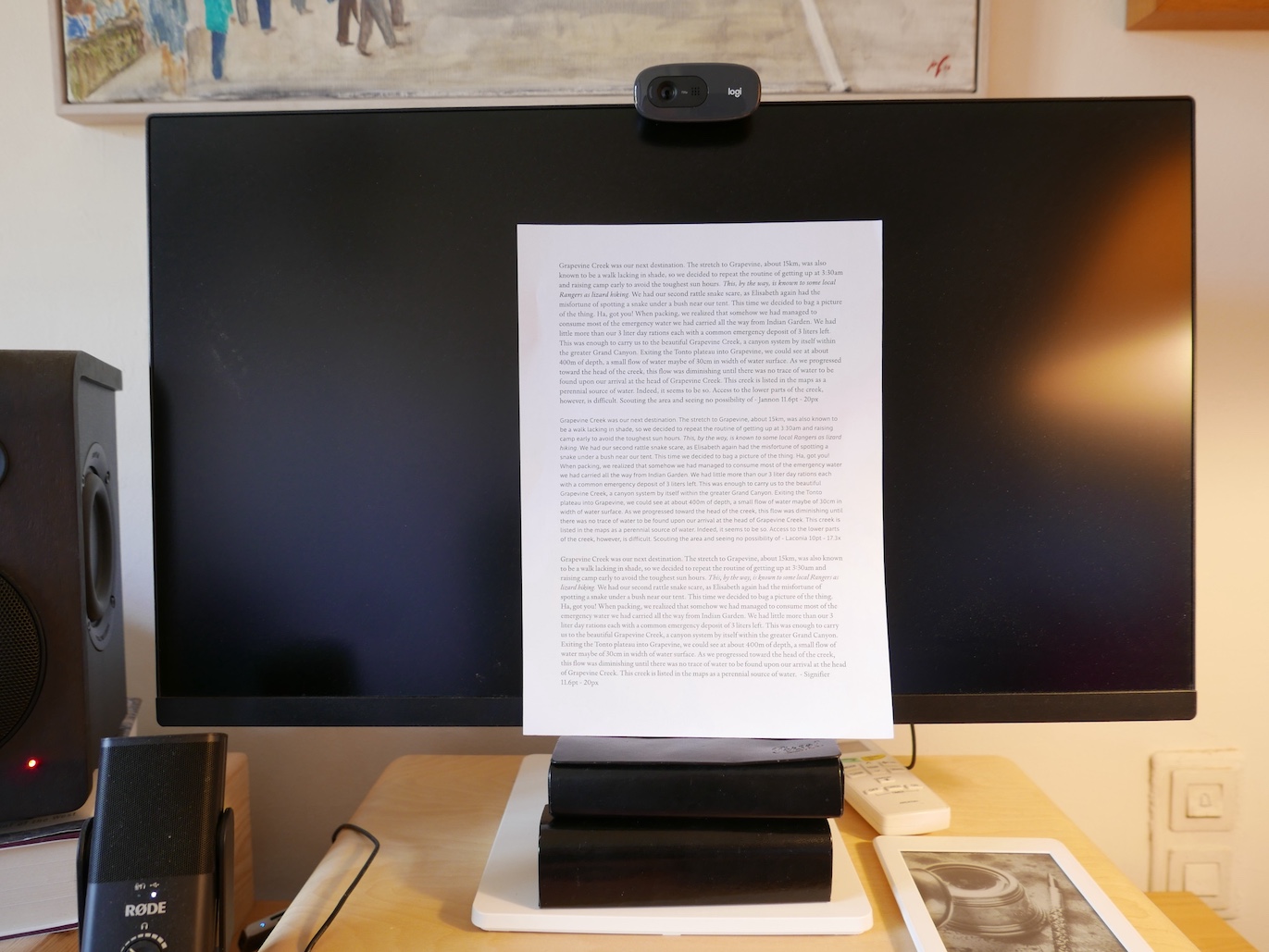
a calibrated photo of paper
While this is a very rough and informal experiment, it’s interesting to see that the brightest area of the page (bottom right corner), hovers around 95% brightness, and the middle area of the page hovers around 92% brightness. I think 92% brightness is good as a reading background. It still feels bright, but it’s noticeably more muted than pure white.
(Some) coping: blue light filters, glasses, decreased screen brightness
A lot of people who work with computers for hours on end complain of eye strain or even eye soreness at the end of their workday.
In recent times, blue light from screens
has emerged as a usual suspect. It’s accused of disrupting circadian
rhythms, making sleep more difficult, harming retinas.
There’s a cottage industry around the “problem” of blue light.
Many people get glasses with a blue-light filter to work on their computers.
Some monitors offer an “eye-saver” mode which reduces the blue light from their
pixels.
And some people, many people, decrease the brightness of their screen altogether.
Understandable coping mechanisms, but they all share a common problem: all
content on screen will have distorted hues (if using anti-blue filters) or
reduced brightness (if turning down the monitor’s brightness). Looking at photos
or videos or games, or even regular pages of text with a muted background, will
be a sub-par experience.
And so we get the proliferation of “picture modes” in modern monitors. I’ve had
monitors with settings such as “gaming”, “vivid”, “reader”, “cinema” etc. Are we
supposed to switch modes when switching activities?
Better coping: high fidelity, themes, and dark mode
In my opinion, monitors should be calibrated for accuracy, which is what we ask of audio equipment. There are some decent and free tools to help you calibrate your monitor. For example, Windows offers a screen calibrator.
Ideally, web designers would take care not to use very bright backgrounds for text, but if they do? Again, the browser extension I created, glareless, can help protect you from that.
Computer nerds, of course, are ahead of the curve. For a long time now, programmers have been setting up their tools (programming editors, terminals, debuggers) with bright-text on dark-background, or with themes, for example everforest, which offer more muted backgrounds, and generally, reduced contrast between text and background.
A lot of websites and tools, and even the major operating systems, offer dark mode, which uses bright text on dark background.
Personally, I like using dark mode in the evening. I find it less pleasant, but it’s easier on the eyes at night, when rooms are more dimly lit. Also, I think it’s good to make using computers in the evening less pleasant. Sleep hygiene and all that.
The ideal fix may never come
The WYSIWYG trend for computers has left us an inheritance of tools that use pure white background. If you use Microsoft Word, or Apple Pages, or many other “office” tools, a full-white background is forced on you. Even if you have set up dark mode in your operating system. Tsk.
I’ve created a browser extension because it’s the only thing in my purview. The proper fix would be at the level of the operating system. You should be able to configure your OS with a settable maximum brightness for text backgrounds.
To really work, that would require all objects on screen to have metadata. All text would declare itself as text. And the operating system would always enforce the user’s wishes for a maximum allowed background brightness, or for dark mode, for text areas.
That may never come, but at least, the makers of office applications should respect dark mode preferences, perhaps even offer themes, and to hell with WYSIWYG.
-
Reasonable licensing, and great fonts like Laconia and Sitka ↩︎
-
Mastodon, from Erik van Blokland (leterror) post 1 of 2 ↩︎
-
Mastodon, from Erik van Blokland (leterror) post 2 of 2 ↩︎