The Right Level of Detail
A recent video from one of my favorite youtube channels1 begins talking about the latest installment of the Zelda video game franchise:
More than almost any game in recent memory, my play-through of The Legend of Zelda: Tears of the Kingdom was full of moments where I’d just stop and stare in astonishment at what the game was showing me.
…
Tears of the Kingdom is a game not even running in 1080p, chugging along on six-year-old hardware that was already technologically behind the alternatives in 2017.
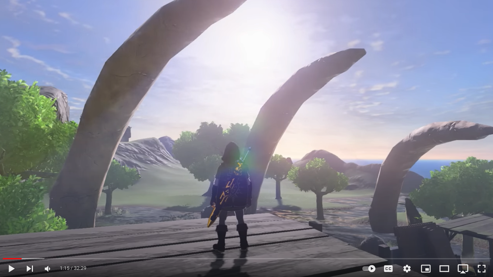
Staring into the Sun, and Other Ways of Capturing Transcendence from Jacob Geller’s channel. Screen capture from Youtube
I was once, long ago, addicted to video games. I used a Spectrum 128+ to play games that came in cassette tapes and took upwards of 5 minutes to load. I would buy the dedicated magazine Micro Hobby, which had all sorts of reviews and previews that I read in rapt anticipation of good times to be had.2
The capture from the video shown above is the kind of thing that would have tantalized me back then.
I quit playing video games cold-turkey in teenage, after realizing with a shock that I was out of control; the addiction has never come back. I sometimes purchase a game out of curiosity for the current state of the art, but I seldom play. I don’t know why I lost interest. Part of the reason is probably esthetic.
Those games in the underpowered machines of the 80’s couldn’t do much visually. Texture and 3D graphics were beyond the capabilities of those early machines, as were physics engines and movie-inspired perspective shifts. A cartoonish esthetic flourished, and games with a small set of simple motions.3
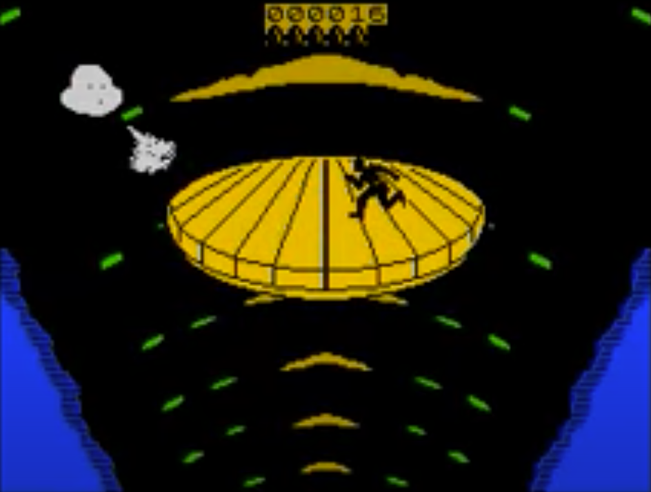
Dragon’s Lair — ZX Spectrum Walkthrough Screen capture from Youtube
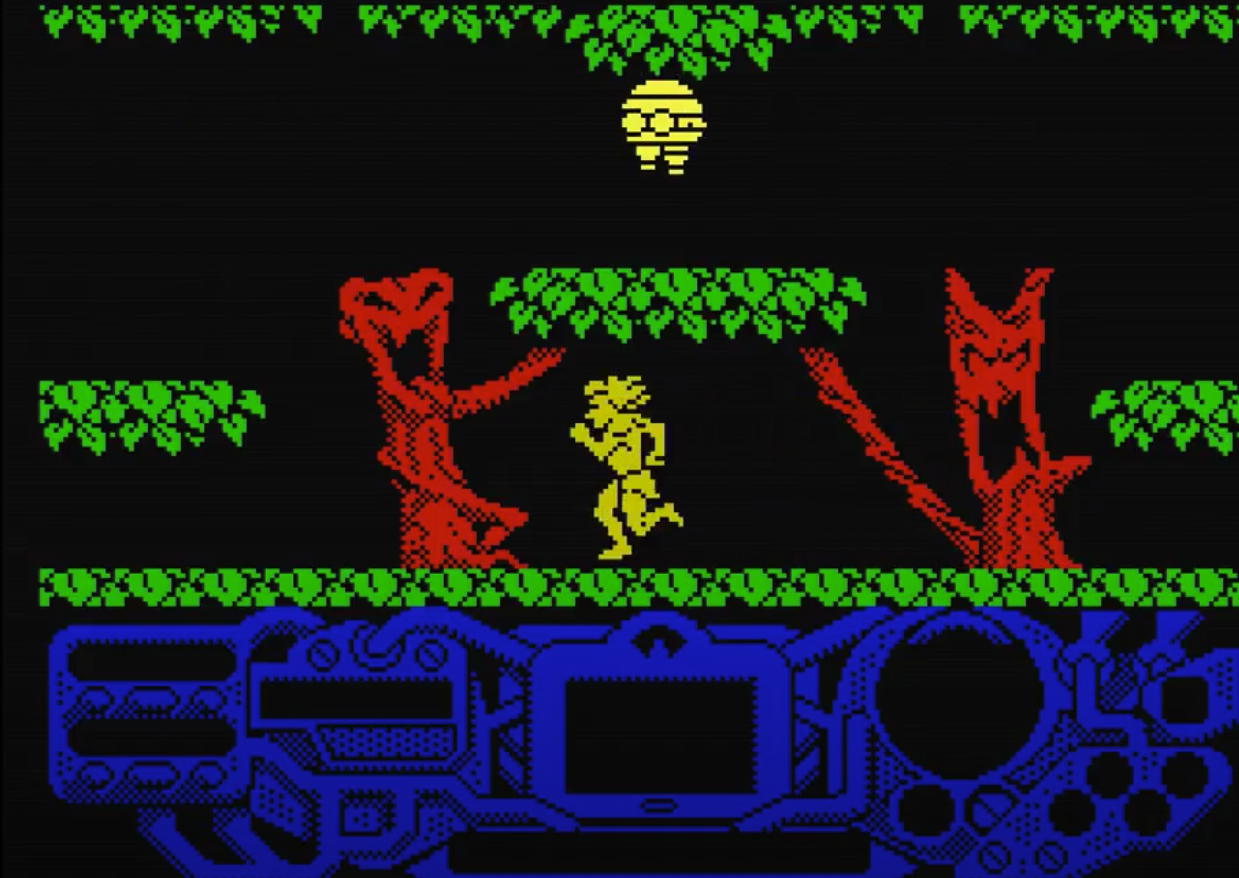
The Sacred Armor of Antiriad — ZX Spectrum Walkthrough Screen capture from Youtube
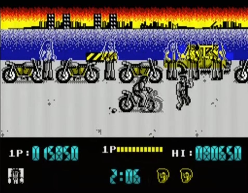
Renegade — ZX Spectrum Walkthrough Screen capture from Youtube
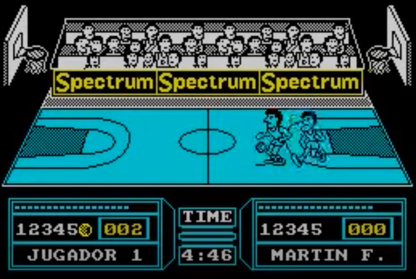
Fernando Martín Basket Master — ZX Spectrum Walkthrough Screen capture from Youtube
Many of the games people rave about now have graphics that approach photo-realism, high quality sound, and some even feature voice work from well known actors. The movie-like experience of those games doesn’t interest me. Give me the cartoonish esthetics and the reduced range of movements.
I seem to have a general preference for a particular level of detail: give me
Tolstoy with his quick descriptions over Tolkien with his meticulousness; the
simplified textures of El Greco or Jon Klassen over the realism of Velázquez. In
typography too, I find I get exhausted reading some fonts that make every corner
of the page call for my attention.
But I do need some texture and some detail. Dalí’s synthetic airbrushed
smoothness disquiets me, as do some fonts that are too featureless.
Back to current games: I have the impression that many of them go heavy on the technology and the buzzwords but light on the inspiration. The same thing often happens with movies. Great technical prowess spent on middling artistic pursuits. Powerful machines to churn out bland images. The best cameras and lenses coupled with poor framing. A brilliant cast of actors wasted on a bad screenplay.
Richard Brody writes this in his review of Jupiter Ascending4:
The studios have things backward, not for the business but for the art of computer graphics. These spectacles should be made by filmmakers who have the highest sense of painterly style, such as Wes Anderson, Sofia Coppola, or, coincidence of coincidences, Terence Nance, Terence Davies, or Terrence Malick. They are precisely the kind of directors who, knowing what to do with a free hand, would be likely to wisely insist upon it.
In 2022 I bought the little indie game A Short Hike5. The premise is simple but
effective. The hero is an anthropomorphic little bird trying to hike up a
mountain. The execution feels natural. You get the hang of controlling the
little bird in a few minutes. It can walk, run, or glide down. From that point
on, it’s about walking through pleasant landscapes and finding your way up the
mountain.
It’s a lovely game, and short. It does not overstay its welcome.
I find the artwork very appealing:
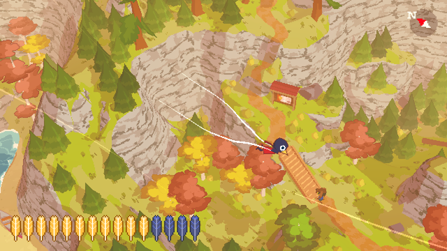
A Short Hike — Wikipedia Wikimedia Commons
There’s a launch day trailer on Youtube.
But, says the wikipedia article on A Short Hike6:
Rendering the game’s world using “big crunchy pixels” and simple models allowed Robinson-Yu to expand the scope of the game in spite of his limited art skills. The color palette for the game is sampled directly from photos of the Canadian Shield in autumn.
Limited art skills, you say? Apparently skill isn’t all it’s cracked up to be.
-
Jacob Geller usually makes videos with a game as a starting point, and with broad scope. ↖
-
The ZX Spectrum 128 +2 was a later version of the original Sinclair ZX Spectrum. MicroHobby was a Spanish magazine published between 1984 and 1992. ↖
-
The Spectrum had the well known problem of attribute clash or or color bleeding that gave games a peculiar look. It was done to save memory and keep costs down. I spent many pleasant hours on these weird looking games. ↖